
V Sanjay Domain Task Report (Level 1)
16 / 3 / 2024
Level 1
Name: V Sanjay
Domain: AI & ML
Batch: 4
Task 1 - Matplotlib and Data Visualization
-
Set Axes Label, Set Axes Limits, Create a Figure with Multiple Plots using Subplot:
- Axes labels were set using
xlabel()andylabel()functions. - Axes limits were set using
xlim()andylim()functions. - A figure with multiple plots was created using the
subplot()function.
- Axes labels were set using
-
Add a Legend to the Plot:
- Legend was added using the
legend()function, specifying labels for each plot.
- Legend was added using the
-
Save Plot as PNG:
- The plot was saved as a PNG file using the
savefig()function.
- The plot was saved as a PNG file using the
-
Plot Types Explored:
- Line and Area Plot
- Scatter and Bubble Plot
- Bar Plot (Simple, Grouped, Stacked)
- Histogram
- Pie Plot
- Box Plot
- Violin Plot
- Marginal Plot
- Contour Plot
- Heatmap
- 3D Plot
GitHub Link: Matplotlib and Data Visualization
Task 2 - Numpy: Array Manipulation Techniques
-
Repeating a Small Array Across Dimensions:
- Objective: Replicate a given array along specified dimensions to create a new array.
- Method: Employ the
numpy.tilefunction.
-
Generating an Array with Element Indices in Ascending Order:
- Objective: Construct a NumPy array containing the indices of its elements arranged in ascending order.
- Method: Combine
numpy.arangeand reshaping.
GitHub Link: Numpy Array Manipulation
Task 3 - Linear and Logistic Regression - Coding the Model from Scratch
Linear Regression
-
Decoding the Algorithm:
- Linear regression predicts continuous values based on a set of independent variables.
- Applications include stock price forecasting, sales predictions, and medical diagnosis.
-
Building a Linear Regression Model:
- Dataset Acquisition: Gather relevant data.
- Data Wrangling: Clean and prepare data.
- Train-Test Split: Divide data into training and testing sets.
- Model Fitting: Train the model.
- Prediction Time: Predict values for testing data.
- Visualization: Compare predicted and actual values.
Implementation Steps:
- Define the Linear Regression Model using the equation ( y = mx + b ).
- Calculate the Cost Function (e.g., mean squared error).
- Use Gradient Descent Optimization to minimize the cost function.
- Predict new data points using the trained model.
GitHub Link: Implementing Linear Regression from Scratch
Logistic Regression
- Logistic Regression is used for classification tasks, predicting the probability of a binary outcome.
- Example: Predicting if an email is spam based on features like word frequency.
Implementing from Scratch: Logistic Regression from Scratch
Task 4 - Metrics and Performance Evaluation
- Understanding Metrics: Metrics and Performance Evaluation
- Implementing Classification Metrics: Classification Metrics
- Implementing Regression Metrics: Regression Metrics
Task 5 - K-Nearest Neighbor Algorithm
-
Introduction:
- KNN is used for classification and regression tasks.
-
Understanding KNN:
- Finds the k most similar points to a new data point.
- Predicts based on the closest points.
-
Implementation Overview:
- Load datasets, split data, train the classifier, evaluate performance, and visualize accuracy.
-
Dataset Selection:
- Select diverse datasets to assess KNN's performance.
-
Results and Analysis:
- Evaluate performance using accuracy metrics and analyze the impact of varying k.
GitHub Links:
Task 6 - Neural Networks and Large Language Models
Blog Link: Neural Networks and LLMs
Task 7 - Mathematics Behind Machine Learning
Curve Fitting:
- Find a mathematical function that best represents a set of data points.
- Curve-Fitting Graph
Fourier Transforms:
- Decompose a function into its constituent frequencies.
- Use MATLAB for signal processing tasks.
MATLAB Code Example:
% Define parameters
Fs = 1000; % Sampling frequency (Hz)
T = 1/Fs; % Sampling period
L = 1000; % Length of signal
t = (0:L-1)*T; % Time vector

% Generate a sine wave
f = 50; % Frequency of the sine wave (Hz)
A = 1; % Amplitude
x = A*sin(2*pi*f*t);

% Compute Fourier Transform
Y = fft(x);
frequencies = Fs*(0:(L/2))/L;

% Plotting
subplot(2,1,1);
plot(t, x);
xlabel('Time (s)');
ylabel('Amplitude');
title('Sine Wave Signal');

subplot(2,1,2);
plot(frequencies, 2*abs(Y(1:L/2+1)));
xlabel('Frequency (Hz)');
ylabel('Magnitude');
title('Fourier Transform');
Figure:
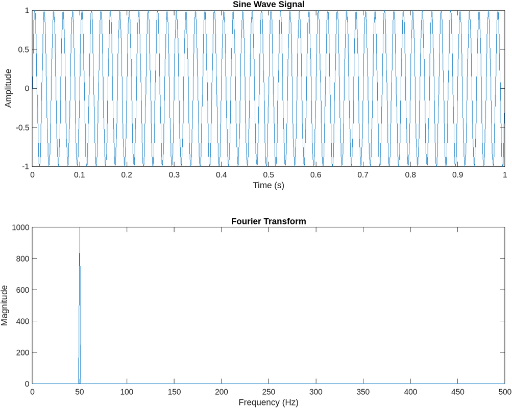
Results and Analysis:
- The generated sine wave signal oscillates at a frequency of 50 Hz, as specified.
- The Fourier transform plot shows a peak at 50 Hz, indicating the presence of the fundamental frequency component.
- The magnitude of the Fourier transform represents the strength of each frequency component present in the signal.
Task 8: Data Visualization for Exploratory Data Analysis
Introduction: Data visualization is crucial for data analysis, enabling analysts and decision-makers to extract insights and communicate findings effectively. While libraries like Matplotlib and Seaborn have been staples in the data visualization ecosystem, Plotly offers advanced capabilities for creating interactive and dynamic visualizations.
Overview of Plotly: Plotly is an open-source graphing library that provides a high-level interface for creating stunning visualizations in Python, R, and JavaScript. Its key features include:
- Interactivity: Plotly visualizations are highly interactive, allowing users to zoom, pan, hover, and explore data dynamically.
- Wide Range of Charts: Plotly supports a variety of chart types, including line plots, scatter plots, bar charts, pie charts, heatmaps, and more.
- Dash Integration: Plotly can be seamlessly integrated with Dash, a Python web application framework for building interactive web-based dashboards.
- Exporting and Sharing: Visualizations created with Plotly can be easily exported in various formats (PNG, PDF, SVG) and shared online through Plotly Cloud or embedded in web applications.
GitHub Link: Data Visualization
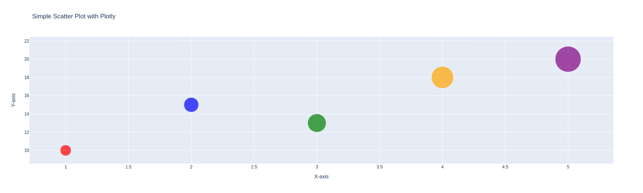
Scatter Plot with Plotly:
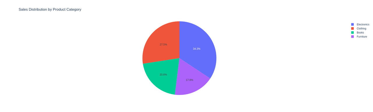
Pie Chart with Plotly:
Task 9: An Introduction to Decision Trees
Introduction to Decision Trees: Decision Trees are a fundamental concept in supervised learning, serving as a versatile tool for both regression and classification tasks. This report provides an overview of Decision Trees, their structure, working principles, applications, and advantages.
Applications of Decision Trees: Decision Trees find applications across various domains, including:
- Classification: Predicting the class label of instances based on their feature values. For example, classifying emails as spam or non-spam.
- Regression: Predicting continuous target variables. For example, predicting house prices based on features like location, size, and amenities.
Blog Link: An Introduction to Decision Trees
Task 10: Real World Application of Machine Learning
Machine learning (ML) has emerged as a powerful tool in healthcare, revolutionizing various aspects such as diagnosis, treatment planning, drug discovery, and patient care. This report delves into a real-world application of machine learning in healthcare, focusing on its significance, challenges, and an example from medical imaging.
Blog Link: Real World Application of Machine Learning