LEVEL 1 - AIML
25 / 10 / 2024
TASK 1 - LINEAR AND LOGISTIC REGRESSION
Linear Regression
Through this task I learnt how Linear and Logistic Regression works and in what way it can be used for predicting continuous values and for classification tasks. Below is the record of my work for this task. I used the iris dataset for the logistic regression and the boston house prices dataset for linear regression.
Flow I followed:
Import Libraries ---> Fit the Dataset into a DataFrame ---> Clean the Data ---> Define What X and Y Is ---> Split the Dataset into Training and Testing Sets ---> Train the Model ---> Test the Model ---> Make Predictions
Linear vs. Logistic Regression
Linear Regression:
- Used for predicting continuous values (e.g., house prices).
- Outputs any real number using a straight-line equation.
Logistic Regression:
- Used for classification tasks (e.g., spam detection).
- Outputs probabilities between 0 and 1 using the sigmoid function, then classifies the result.
Linear and Logistic Regression Notebook
TASK 3 - NumPy
What it is:
NumPy is a fundamental library in Python for numerical computing, providing support for large, multi-dimensional arrays and matrices.
Efficient Operations:
It offers a wide range of mathematical functions that enable fast and efficient element-wise operations on arrays, allowing for complex calculations without explicit loops.
Foundation for Other Libraries:
NumPy serves as the foundational package for many other scientific computing libraries, such as SciPy and Pandas, making it essential for data analysis and various machine learning algorithms.
TASK 2: Matplotlib and Data Visualization
This was a fun task! Below is the record of whatever I learnt.
Why is this Important?
Understanding Data:
Data visualization helps uncover underlying patterns, trends, and distributions, making it easier to identify key features and relationships before building machine learning models.
Model Evaluation:
Visualizing model performance (e.g., confusion matrices, ROC curves) allows for assessing model effectiveness, identifying improvement areas, and comparing different models.
Communicating Results:
Effective visualizations facilitate clear communication of findings and insights from machine learning models to both technical and non-technical audiences, enhancing understanding and impact.
Debugging and Error Analysis:
Visualizing predictions against actual outcomes helps quickly identify errors or outliers, aiding in debugging and refining models for improved accuracy.
Matplotlib and Data Visualisation Notebook
TASK 7: Elementary Step in Understanding Neural Networks
What is a Neural Network?
- Definition: A computational model inspired by the human brain's neuron structure.
- Components:
- Input Layer: Data entry point.
- Hidden Layers: Intermediate processing.
- Output Layer: Produces predictions.
How Neural Networks Work
- Neurons: Process inputs through layers.
- Weights: Importance assigned to inputs.
- Activation Functions:
- Sigmoid: Outputs between 0 and 1.
- ReLU: Returns 0 if negative; else, the input.
- Tanh: Outputs between -1 and 1.
Training a Neural Network
- Forward Pass: Data flows to produce output.
- Loss Function: Measures prediction error.
- Backward Pass: Adjusts weights to minimize loss.
Large Language Models
I understood what Large Language Models are and how it is used. Below is an article I wrote about LLMs.
TASK 10: An Introduction to Decision Trees
A decision tree is a supervised machine learning model used for classification and regression tasks. It resembles a flowchart that divides a dataset into smaller subsets based on feature values, ultimately leading to predictions.
How It Works
Splitting --->Creating Branches --->Recursive Process --->Leaf Nodes
TASK 4: METRICS AND PERFORMANCE EVALUATION
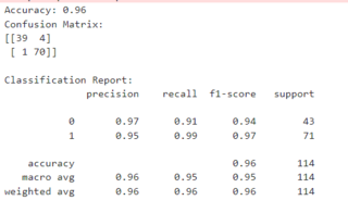
Understood the different classification and regression metrics that were there which help us evaluate how well our model performs.
Classification Metrics (for categorizing data):
-
Accuracy:
- Percentage of correct predictions.
- Example: 90 out of 100 correct = 90% accuracy.
- Can be misleading with imbalanced data.
-
Precision:
- Proportion of predicted positives that are actually correct.
- Example: 15 out of 20 flagged as spam are actually spam = 75% precision.
- High precision means fewer false alarms.
-
Recall (Sensitivity or True Positive Rate):
- Proportion of actual positives that the model identified.
- Example: 20 out of 30 spam emails detected = 67% recall.
- High recall means fewer missed cases.
-
F1 Score:
- Balances precision and recall.
- Useful when there's a trade-off between the two.
- Example: If precision is 80% and recall is 60%, F1 Score combines these for a single performance measure.
-
AUC (Area Under the Curve):
- Represents the area under the ROC curve.
- A higher AUC indicates better model performance in distinguishing between classes.
- Example: AUC of 0.9 shows strong distinction ability between spam and non-spam emails.
-
ROC (Receiver Operating Characteristic) Curve:
- Graphically plots the True Positive Rate (Recall) against the False Positive Rate for various threshold settings.
- A steeper curve (closer to the top left corner) indicates better performance.
Regression Metrics (for predicting continuous values):
- Mean Squared Error (MSE):
- Average squared difference between actual and predicted values.
- Lower MSE means better predictions.
- Root Mean Squared Error (RMSE):
- Square root of the average of squared differences between actual and predicted values.
- Penalizes larger errors more heavily.
- Example: In temperature prediction, a lower RMSE indicates higher accuracy.
- Mean Absolute Error (MAE):
- The average of the absolute differences between actual and predicted values.
- Represents the average magnitude of errors directly.
- Example: A lower MAE in house price predictions suggests closer estimations to actual values.
-
Mean Absolute Percentage Error (MAPE):
- The average of the absolute percentage differences between actual and predicted values.
- Useful for evaluating model accuracy in terms of percentage.
- Example: In sales forecasting, lower MAPE means more accurate sales predictions in terms of percentage deviation.
-
R-squared (R²):
- Indicates how well the model explains data variation.
- Example: R² = 0.9 means 90% of the variation is explained.
- A perfect model has R² = 1.
TASK 9: Desmos Graphs and Fourier Transforms
Part 1: Desmos Graph for Machine Learning Visualization
Website: Used Desmos Graphing Calculator
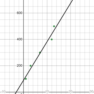
Created the Graph:
- Input Values: Use a table format in Desmos to enter values for ( x ) and ( y ) based on the data you want to analyze or visualize.
- Adjust Bounds: Modify the upper and lower bounds of the graph as needed to focus on specific data ranges, which can help you understand trends and relationships between variables.
Plotted Data Points:
- Connected these points to form a line graph.
Using Desmos for this type of visualization helped me see how different input values affected the output, and enhanced my understanding of data trends and the basic relationships that form the foundation of machine learning models.
Desmos Graph for Machine Learning
Part 2: Fourier Transforms in Signal Processing
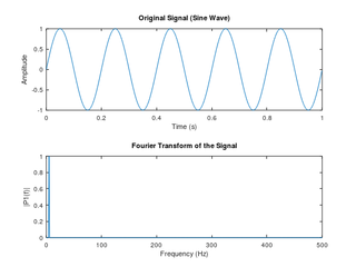
Fourier transforms are a mathematical tool used to decompose a complex waveform into simpler sine and cosine components, representing the frequency domain. This decomposition is crucial in signal processing, data compression, and machine learning applications like image processing and feature extraction.
Creating the Fourier Visualization:
- Input Sine Waves: Plot basic sine and cosine waves of different frequencies. For example, start with (\sin(x)) and add components like (\sin(2x)), (\sin(3x)), etc.
- Overlaying Waves: To create a composite wave, add multiple sine or cosine functions, each with a different frequency, phase, and amplitude. This will visually demonstrate how Fourier transforms approximate complex signals.
- Frequency Spectrum Plot: Create a separate plot showing each frequency’s amplitude, allowing you to visualize the amplitude spectrum, which represents how strongly each frequency contributes to the overall waveform.
Understanding Fourier Transforms:
- Fourier transforms decompose signals by isolating individual frequencies, which is fundamental in identifying patterns in datasets, particularly in time-series or audio data.
- By adjusting the amplitudes and frequencies, you can experiment with the effects of each component on the final signal, illustrating how Fourier analysis captures essential features for machine learning applications.
This exercise highlights how Fourier transforms simplify complex data, helping reveal periodic patterns and features within a signal.
Fourier Transform Visualization
TASK 9: Data Visualization for Exploratory Analysis
For this task, I created my own dataset and the results are as below in the notebook.
TASK 6: K Nearest Neighbour Algorithm
Definition: KNN is a simple, non-parametric classification and regression algorithm that predicts the class of a data point based on the classes of its nearest neighbors in the feature space. Use Cases:
- Classification: KNN is widely used for tasks like email filtering (classifying emails as spam or not spam) or determining whether a tumor is benign or malignant based on its features.
- Regression: KNN can also predict continuous values, such as predicting house prices based on the prices of nearby houses with similar features.
K-Nearest Neighbour Algorithm Notebook
TASK 11: SVM
Support Vector Machine (SVM) is a supervised machine learning algorithm used for classification and regression tasks.
Classification: SVM is primarily used for classification problems, where it helps to separate different classes or categories in a dataset.
Hyperplane: SVM finds the best boundary (called a hyperplane) that separates different classes in the feature space. The hyperplane is chosen to maximize the distance (margin) between the closest points of the classes, known as support vectors.
Support Vectors: These are the data points that are closest to the hyperplane. They are crucial for defining the position and orientation of the hyperplane. If you remove other data points, the support vectors still determine the hyperplane.
TASK 5: LINEAR AND LOGISTIC REGRESSION FROM SCRATCH
Linear Regression
- Import necessary libraries (
numpy,matplotlib,pandas,gdown). - Download and load data from a Google Drive link.
- Split the data into features and target variables, and plot the data.
- Normalize the feature data (house size and rooms) by standardizing.
- Define the hypothesis function ( h(x, \theta) ) for predictions.
- Define the cost function to calculate the error (MSE).
- Implement gradient descent to minimize the cost function and update parameters.
- Plot the cost over epochs to visualize model convergence.
- Test the model by predicting the price for a given house using learned parameters.
Logistic Regression
- Import necessary libraries (
numpy,pandas,matplotlib,gdown). - Download and load the dataset, cleaning and splitting columns, and removing missing values.
- Define the sigmoid function to convert linear outputs into probabilities.
- Implement the cost function using binary cross-entropy (log loss).
- Apply gradient descent to minimize the cost function and update model parameters.
- Track and plot the cost over epochs to monitor the convergence.
- Define a prediction function to classify based on a threshold of 0.5.
- Train the model, printing the final cost and parameters after gradient descent.
- Test the model by making predictions for a given input.


