
# Level 02: Final Report
16 / 6 / 2025
Here is the link to my GitHub Repository:
https://github.com/NiliS2006/nilima-.git
Task 01: Linear and Logistic Regression - HelloWorld for AIML
- Acquainted myself with the basics of both Linear and Logistic Regression.
- Linear Regression: It models the relationship between a dependent variable 'y' and one more independent variable 'x', assuming the relationship between both variables is linear(straight line).
y = w*x + b
or
y = w^T(x) + b (for vectorised inputs)
where:
- y: predicted value
- x: input feature
- w: weights or slopes
- b: bias or intercept value
- Logistic Regression: It is used for Classification and not regression. It predicts the binary outcomes. It passes the same input for linear regression as a sigmoid function, and a probability between 0 and 1 is predicted.
z=w^T(x)+b
y'=σ(z)=1/(1+e^−z)
where:
- y: predicted probability
- z: linear score
- σ(z): sigmoid activation function
If y>0.5, predict 1 (positive class); otherwise, predict 0.
Task 02: Matplotlib and Data Visualisation
-
Pandas is an essential Python library for data manipulation and analysis, widely used in data science, machine learning, and statistical computing. It provides powerful, flexible data structures like DataFrames and Series to handle structured data efficiently. With Pandas, users can perform operations such as filtering, grouping, aggregating, and reshaping data effortlessly. Its ability to handle missing data, merge datasets, and integrate seamlessly with libraries like NumPy and Matplotlib makes it indispensable for preprocessing and visualization tasks.
-
On the other hand, Matplotlib is a powerful Python library for data visualization, enabling users to create a wide variety of static, interactive, and animated plots. Its versatility and simplicity make it an essential tool in data science, machine learning, and scientific research. From plotting basic scatter plots to simple line or bar graphs, Matplotlib customizes visualizations and creates advanced chart types like: Heatmaps, contour plots, 3D plots, and pie charts.
My Kaggle Notebook:- Line Plot: shows how data changes over time or order
- Area Plot: area under the line is filled
- Scatter Plot: dots show individual data points
- Bubble Plot: scatter plot where dot size is a bubble
- Bar Plot: rectangles showing various categories
- Simple Plot: plots or lines
- Grouped Plot: bars or points grouped categorically
- Stacked Plot: bar plots stacked on each other
- Histogram: distribution of data by binning values
- Pie Plot: circular chart sliced up
- Box Plot: data is spread using quantities and medians
- Violin Plot: box plot that is a rather distributed shape
- Marginal Plot: scatter plot + histogram
- Contour Plot: 3d data is contourized on a 2d plane
- HeatMap: coloured squares that represent values
Task 03: Numpy
I used NumPy library to generate an array and repeat a small array across various dimensions and display various results across different orders as well. Reshaping is also done by editing details of the array. My Kaggle Notebook:
Task 04: Metrics and Performance Evaluation
Regression metrics- is used for metrics evaluation of regression output. I learnt about the various terminologies connected with the same.
- Mean Absolute Error (MAE): Average absolute difference between predictions and true values.
- Mean Squared Error (MSE): Average squared difference; penalizes big errors more.
- Root Mean Squared Error (RMSE): Root Mean Squared Error (RMSE)
- Mean Absolute Percentage Error (MAPE): Average absolute percent error; scale-invariant.
- R^2: Proportion of variance in y explained by the model (0–1).
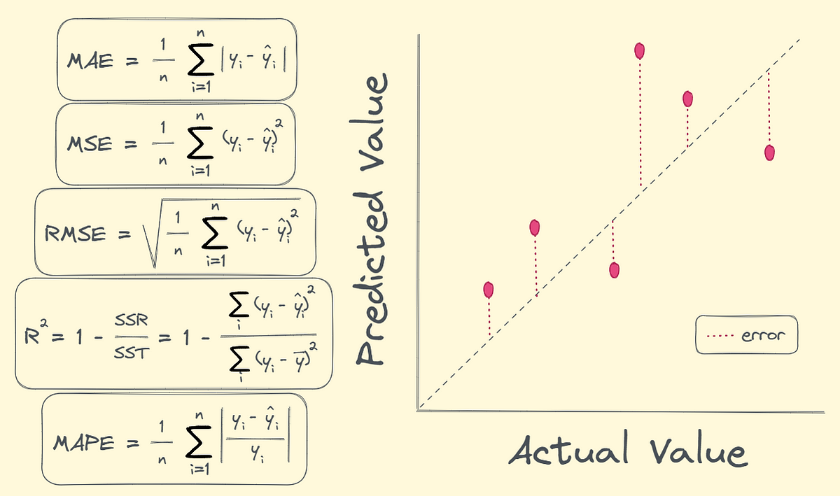
Classification metrics-It is used for metrics evaluation of classification output.
- Accuracy- It is the number of correct predictions divide by the total number of predictions.
- Precision- It tells of all the data labelled positive how many of them are actually positive.
- F1 score- Combines precision and recall by finding their harmonic mean.
My notebooks further depict both these metric uses.
Task 05: Linear and Logistic Regression - Coding the model from SCRATCH
-
Linear Regression
-
Logistic Regression

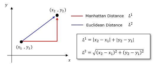
Task 06: K- Nearest Neighbor Algorithm
- I studied about the KNN algorithm, which classifies a data point based on how its nearest neighbors are classified.
- Working of the algorithm:
  1. First, a value for 'k' is chosen, i.e., the amount of neighbours to be looked at.
  2. Next, Euclidean distances are measured from the test point to every other training point.
  3. The K closest neighbours are found and we predict that label which appears most among those chosen closest neighbours to the actual data point.
  4. Based on this detail, we apply regression on the K-neighbours' values to find the best k-value for the dataset.
Euclidean Distance:
Task 07: An elementary step towards understanding Neural Networks
I have written Blog Posts regarding both for which the links have been provided. Neural Networks:Neural Netwroks LLM:LLM
Task 08: Mathematics behind machine learning
Desmos was a really good platform to study the true math behind how a machine learns from data, how it classifies data and draws a line to connect various points plotted on the graph.
 Fourier transform- To decompose different mixed frequencies as a pure signal, we can convert time domain signal to frequency domain signal. When the frequency of the frequency domain graph becomes same as any of the pure frequencies, we observe a peak in the graph enabling us to find the pure frequencies making up time-domain signal.
code: #Fourier transform
fft_values = np.fft.fft(sig)
#Finding the frequency
fft_freq = np.fft.fftfreq((len(sig)), d=(1/fs))
#Extracting the positive frequencies only
pos = fft_freq >= 0
freqs = fft_freq[pos]
#Amplitude
magnitudes = np.abs((fft_values[pos]) * 2 / (len(sig)))
Fourier transform- To decompose different mixed frequencies as a pure signal, we can convert time domain signal to frequency domain signal. When the frequency of the frequency domain graph becomes same as any of the pure frequencies, we observe a peak in the graph enabling us to find the pure frequencies making up time-domain signal.
code: #Fourier transform
fft_values = np.fft.fft(sig)
#Finding the frequency
fft_freq = np.fft.fftfreq((len(sig)), d=(1/fs))
#Extracting the positive frequencies only
pos = fft_freq >= 0
freqs = fft_freq[pos]
#Amplitude
magnitudes = np.abs((fft_values[pos]) * 2 / (len(sig)))
 becomes

Task 09: Data Visualization for Exploratory Data Analysis
My graphs will say whatever I learnt about using Plotly. I created different graphs of different categories to show the difference between each kind. It is just super-interactive, unlike matplotlib. Here, you can create graphs which can be zoomed in and out of and even animated ones.
Task 10: An introduction to Decision Trees
- Basically, Decision Trees are supervised learning algorithms that make decisions step-by-step. We can actually describe it this way. 1. Internal nodes: ask questions about the data 2. Branches: are the outcomes of the questions 3. Leaves: are the finals decisions
- First, we pick the best feature to split: criteria like Gini impurity(classification), Entropy(information gain) and MSE(regression) are used.
- The dataset is split up and recursively, this process is repeated to make predictions.
- Gini impurity: probability of misclassifying a random element if labelled randomly
- Entropy: un-certainty in a dataset
Task 11: Support Vector Machine
- This is also a supervised learning algorithm to find the best boundary that separates data into different classes. It finds the widest possible gap between classes and places the decision boundary right in the center. This margin tells us the distance between the hyperplane and the closest data points. These closest points are called 'support vectors'.